2nd December - 29th December 2024 (Week 11 - Week 14)
Sin Jun Ming 0364638
Application Design / Bachelor of Design in Creative Media / Taylor's University
Task 3 - Low-Fidelity App Design Prototype
LECTURES
Week 11 - Wireframe Design
In this week's physical class, Mr. Zeon briefed us about what to do in the task 3 for our lo-fi prototype design. He first talked about how to use Figma to design prototype, and also explained the requirements in the lo-fi app design prototype like no colors or icons needed etc. Mr. Zeon also showed us the project timeline and we must follow the timeline so that we can handle the workload and submit the assignment on time.
Week 13 - Lo-fi prototype Consultation
As we have completed our lo-fi prototype this week, we have one-to-one consultation with Mr. Zeon in the class to get valuable feedback and enhance our prototype.
INSTRUCTIONS
Task 3 - Low-Fidelity App Design Prototype
Instructions:
- Once the UX design process is completed, can now create a low fidelity prototype of the app. We needs to arrange all the screen wireframes, actions, visual feedback and link them up in Adobe XD/ Figma/ Invision Studio or any other prototype software’s.
- We are then required to perform usability testing whereby they will invite guests to test out their low fidelity prototype and gather all the information, response, feedback, pain points observed from the test.
- We need to document this process with video and produce a document containing detail analysis of this task and the solutions to the problems faced by the testers.
Requirements For This Task:
1. Visual Design Concept:
Develop a visual design concept that aligns with the branding of your application. This concept should include color schemes, typography, and imagery that convey the desired look and feel of your application.
2. Wireframes:
Create wireframes of the screens for your mobile application. These wireframes should illustrate the layout and content of each screen, including the navigation and interaction elements. You should use tools such as Figma, or Adobe XD to create these wireframes.
3. Usability Testing:
Conduct usability testing on your low-fidelity prototype to validate the user flow and user experience. You can recruit friends, family, or classmates to test your prototype and provide feedback. Make sure to document the feedback and use it to iterate on your design.
4. Deliverables:
Submit a digital document that includes your low-fidelity prototype, wireframes, and visual design concept. Also, include a brief summary of your usability testing results and how you used them to refine your design in your e-portfolio
Week 11-12 / Wireframe Design
1. Visual References
First of all, to start designing the wireframe, I went through some visual references to get inspirations. I searched for some popular design portfolio websites like behance.com, dribbble.com etc. I searched for the keyword "education app UI design" on these websites.
2. Design Process
The design concept of my new Encode app is a modern and easy-to-use application that is very user-friendly to everyone. I intend to use horizontal scrolling box layout to contain all the courses in the homepage so that user can see all the courses available immediately once clicked into the app.
Fig 2.1 Log in page
Fig 2.2 Homepage design
Fig 2.3 Course description and overview
Fig 2.4 Lecture pop-up
Fig 2.5 Challenges pages
Fig 2.6 Progress page
Fig 2.7 Overall design
3. Completed Lo-Fi app design prototype
I designed 3 scenarios for user to perform certain tasks. Here are the demonstrations of these 3 scenarios.
First scenario:
At the homepage, click on the Java course either from "Recommended Courses" or from "Skill Selection".
Then, description and course lecture overview will be shown. Current progress of lecture will pop up once the "Let's go" button is clicked.
Fig 3.2 Course description and overview
Fig 3.3 Lecture pop-up
Eventually, the user will go through a series of lecture and finally complete an exercise at the end. User will be rewarded in addition of XP once the lecture is completed.
The user will need to complete a "Challenge" for the second scenario. The user will click on the first challenge - "Visitor Report" and start the challenge. XP will be rewarded for each question answered.
Fig 3.5 Challenge questions (1)
Fig 3.6 Challenge questions (2)
A reward page will be shown in the middle of the challenge to motivate the user in finishing the remaining question.
Fig 3.7 Reward page
Eventually, user will get to see the total XP earned throughout the challenge once it is completed.
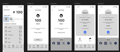
In this scenario, user will go to the progress page through the navigation bar and check out all the features. First feature is the day streak feature where user can see how many day that he has been using this app.
Fig 3.9 Progress page
Fig 3.10 Day streak page
User can also see his completion certificates for the courses he has 100% done.
Fig 3.11 Completion certificate page
Last but not least, user gets to see his achievement badges that he has achieved within the app.
Fig 3.12 Achievement badges page
Other features:
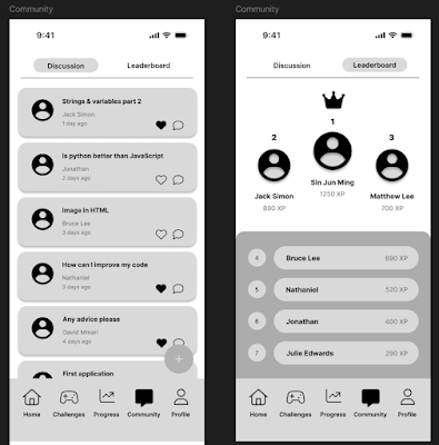
Fig 3.14 Discussion and Leaderboard page
Fig 3.15 "Add a new post" page
Fig 3.16 Profile page
Week 13 / User Testing
By conducting user testing, the usability of the lo-fi prototype can be examined effectively. I will recruit 3 participants, assigning one scenario to each user. I will conduct the testing via Zoom and send them the Figma link. After the testing, feedback will be gathered from the participants to improve the prototype. I will now recap the three scenarios:
First scenario: Complete a lecture
- At the homepage, click on the Java course either from "Recommended Courses" or from "Skill Selection".
- Then, description and course lecture overview will be shown. Current progress of lecture will pop up once the "Let's go" button is clicked.
- Eventually, the user will go through a series of lecture and finally complete an exercise at the end. User will be rewarded in addition of XP once the lecture is completed.
Second scenario: Complete a challenge
- The user will need to complete a "Challenge" for the second scenario. The user will click on the first challenge - "Visitor Report" and start the challenge. XP will be rewarded for each question answered.
- A reward page will be shown in the middle of the challenge to motivate the user in finishing the remaining question.
- Eventually, user will get to see the total XP earned throughout the challenge once it is completed.
Third scenario: View and share the progress
- In this scenario, user will go to the progress page through the navigation bar and check out all the features. First feature is the day streak feature where user can see how many day that he has been using this app.
- User can also see his completion certificates for the courses he has 100% done.
- Last but not least, user gets to see his achievement badges that he has achieved within the app.
4. User Testing Video
User 1 - Jun Yu: https://youtu.be/xH9ctWsFs-Q
Video 4.1 User 1 - JunYu
User 2 - Yong Ping: https://youtu.be/WCnnQ-L0U9w
Video 4.2 User 2 - Yong Ping
User 3 - Natalie: https://youtu.be/PvQ9dPLYorM
Video 4.3 User 3 - Natalie
5. User Feedback
Fig 5.1 User feedback PDF
Homepage redesign - Common opinions indicates that the homepage redesign enhances the visual experience compared to the original app. Different categories are arranged very well at the homepage and visual hierarchy is good.
Addition of navigation bar - With the addition of a navigation bar, users gave feedback on better navigation experience. Users can now navigate to different pages easily and effortlessly.
Ease of completing tasks - The three tasks assigned are pretty easy to be completed according to the user feedback. The task is simple and straight-forward which avoid user spending too much time on a single task.
6. Final Outcome
Demonstrating Video: https://youtu.be/NZLx3BsHAbc
Video 6.1 Demonstrating video
Figma Link: https://www.figma.com/design/3SSx65BfLUSgWptpKXGpOe/Encode-lo-fi-prototype?node-id=0-1&t=vjPwZdaGW7xCJ0Ik-1
Feedback
Week 12
The app layout is quite standard for now, focus on the features for three scenarios so that the users can perform certain tasks successfully in the lo-fi prototype.
Week 13
The first and third scenario (completing a course and view progress) is fine, the second scenario (challenge) needs more steps for user to make actions, consider adding reward page in the middle of questions so that users are more motivated to complete the challenge.
Reflection
Completing the low-fidelity prototype of the Encode app redesign has been a valuable process. It allowed me to focus on foundational aspects such as user flows, information hierarchy, and core interactions without getting bogged down by visual design details.
From the data collected in Task 2 (UI/UX document), the making of lo-fi prototype was not that hard. However, it was a challenge to create all the UI layout and elements for the application as it is a new thing to me. The process was fun as I can see the result showing throughout the making of lo-fi prototype, and I am excited to see the final product once everything is done.
The next steps will involve refining the design based on additional feedback, creating a high-fidelity prototype, and incorporating branding and aesthetics. Overall, this stage has laid a solid foundation for a user-centered redesign.


Comments
Post a Comment