21st October - 15th November 2024 (Week 5 - Week 8)
Sin Jun Ming 0364638
Advanced Interactive Design / Bachelor of Design in Creative Media / Taylor's University
Task 2 - Interaction Design Planning and Prototype
INSTRUCTIONS
Task 2 - Interaction Design Planning and Prototype
Students are required to work on their visual design and start planning their website’s interactive design elements and features. Unlike traditional static website, when it comes to interactive design where animations are present, the plan not only should include the layout visuals but also the animation example or reference. Students can build their animation or user-reference animation to demonstrate the intended idea.
Requirements:
- Walkthrough Video presenting the plan and showing the animation examples and/or references.
- Online posts in your E-portfolio as your reflective studies with links to any resource involved in the creating of the plan. (i.e.: Figma link, Miro link, etc.)
1. Design
Welcome pages
I wish to create a landing page which is clean and simple to showcase the luxurious brand Rolex, and to give a brief introduction to the audience about the title of this website - The Harmony of Contrast, New Watches 2024. Iconic colors from Rolex, emerald green and yellow gold is used in the landing pages.
Product pages
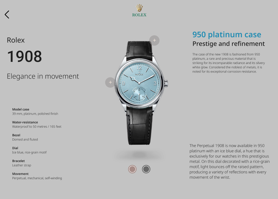
A. Product 1 - 1908
The product page has colour selection button that can be clicked, the background colour and information text color will also be changed to the according watches' colors.
The "+" button can be clicked to show the details of the watches. The background turns blur and background color remains. The button also will be enlarged while hovering.
B. Product 2 - Cosmograph Daytona
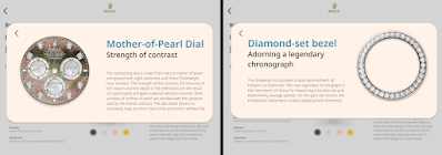
This product has a total of 4 variations, which the page also has colour selection button that can be clicked, background color and information text color will be changed accordingly.
As usual, the "+" button can be clicked to show the details of the watches. The background turns blur and background color remains.
To match the theme of the product, the background color - dark blue is used to create a deepsea background to highlight the product. Light blue is used on the information text to convey the message of the product motto - "Bringing light to the deep". This product has no variation, hence there is no color selection button.
As usual, the "+" button can be clicked to show the details of the watches. The background turns blur and background color remains.
Prototype link: https://www.figma.com/design/HLHldYmGfkL2kOIhYCjdHy/task-2-prototype?node-id=0-1&t=UJx12klvVRVh5e0y-1
Prototype Walkthrough Video
YouTube link: https://youtu.be/HZv2FG48SJ0
Reflection
Comparing this task from the last task, I did some changes from the wireframe to the prototype now. I think it is a valuable process to keep updating on new ideas to apply on my design. I am looking forward for the final website when everything is done.


Comments
Post a Comment